Best practices for plotting charts with data points
This best practice guide focuses on giving developers the ability to use the powerful and flexible Time Series API to render the most precise, high fidelity charts possible. Whilst the guide focuses on high fidelity charts, the techniques outlined herein may be adapted to suit different use cases where lower granularity/ lower fidelity is preferred (such as weekly or monthly reports).
Plot Area Resolution
It is important to know the resolution of the plot area, in order to be able to determine the maximum data fidelity it is possible to draw in the plot area. If a single pixel represents a single data point, then the horizontal resolution of the plot area represents the maximum number of data points it is possible to plot. This is true of both raw data points, and aggregations. When drawing a plot where the number of data points approaches the number of pixels available, we can call this the highest data fidelity approach to plotting.
Starting with the highest possible fidelity chart we can draw. Let’s assume we have a 1080p monitor with a horizontal resolution of 1920 pixels. Let’s assume that our chart plot area is 1500 pixels wide, leaving some space either side for other GUI elements. If we fully ‘zoom in’ to the data, we can plot 1500 raw data points on the screen at any one time.
However, when we ‘zoom out’ and view the data over a longer period of time, we will begin to have more data points in the desired plot than there are pixels to plot on. In this situation, aggregation is required to happen in order to fit the data on the screen.
Aggregation can happen in several ways. If the chart retrieves more raw data points than there are pixels, aggregation happens within the graphical layer, where the graphics driver of the machine rendering the plot will aggregate / interpolate based on the algorithms built into the graphics driver. Whilst this form of client-side aggregation may render a reasonable approximation of the chart we wish to plot, we lose control over how we want the plot to behave to the graphics driver, which in many data science scenarios may result in a loss of precision we wish to avoid. This approach also risks slowing down client applications, due the client first having to download an excessive number of raw data points, and then due to excessive RAM utilisation (holding all the raw data points in memory).
A better way to render aggregated data points in the client application, is to use the aggregate function within the Time Series API. The aggregate function allows the user to more precisely define the size of the aggregate buckets we wish to plot (i.e. the number of data points in each aggregation bucket). Using the Time Series API aggregate function also improves client system performance, as the user retrieves only the number of aggregated data points required to plot on the screen and no more (consuming far less network bandwidth, RAM, and other system resources).
In summary, when the number of data points we need to plot exceeds the number of pixels available in the plot area, the Time Series API aggregate function should be used.
Average, Min, Max and Standard Variance
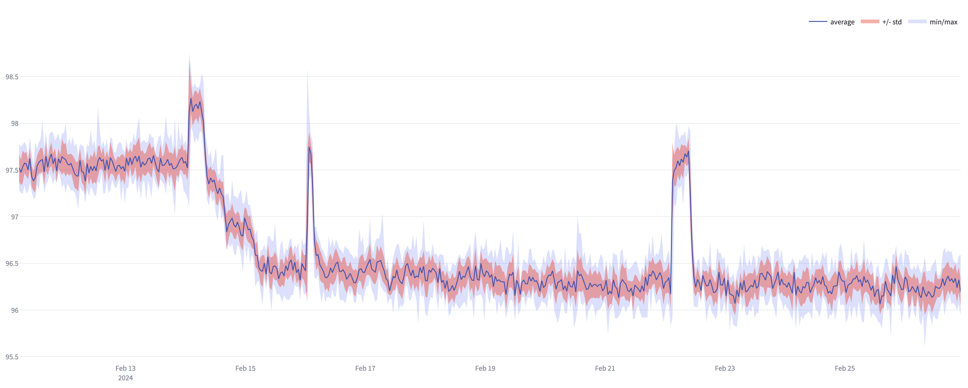
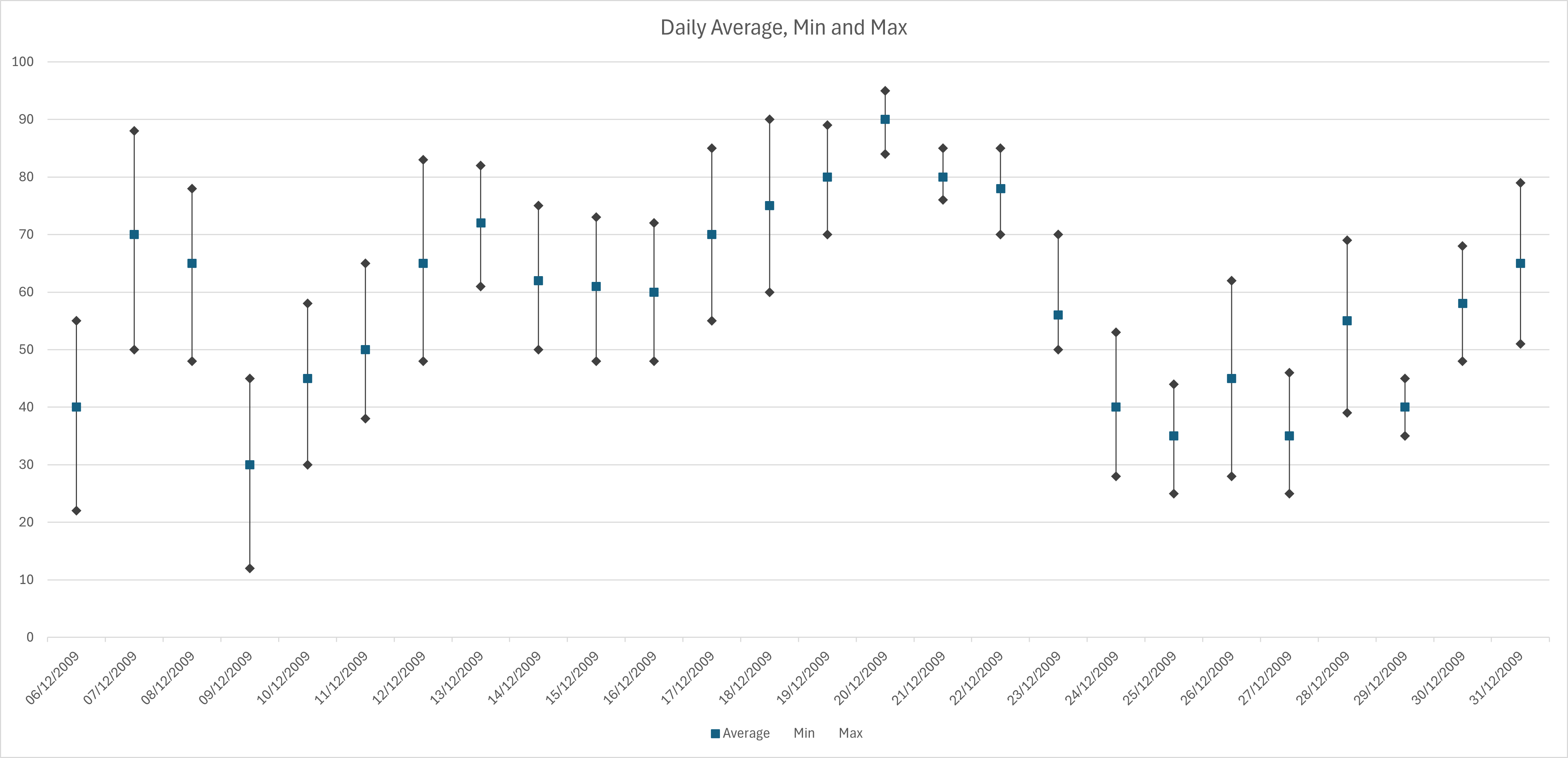
When plotting charts where the data is aggregated, a natural first choice is to calculate the average value of the data points for each bucket. However, if there are outlier values in a given bucket, using only the average calculated values will lose potentially valuable information. Therefore when plotting data using aggregate buckets, consider whether to also include plotting of min and max values along with the average to provide the fuller picture.
Further insight may be gained by including the variance aggregate values. For example, by calculating the square root of the continuousVariance value for a given aggregation period, it will tell you the standard deviation. This could be plotted on a chart to indicate to the viewer, the proportion of outliers from the mean there are in that time period.
NOTE: For the most common cases when analysing time series data, continuousVariance is the most appropriate aggregate. For time series with a fixed frequency, discreteVariance may be used.
When maximising the use of the screen real estate to provide the highest possible data fidelity (i.e. plotting aggregated data points per pixel), using the format illustrated in the chart below may be desirable.

With less granular plots, with fewer aggregate buckets along the X-axis, the scatter plot format may be more appropriate such as depicted below:

How to choose aggregate bucket size
Let’s use a worked example to illustrate how the Time Series API may be used to select the most appropriate aggregate bucket size to render the most precise view of the data. This example uses the average aggregation. The example is also valid for use of Min and Max aggregate types.
NOTE: This example does not suggest that plotting the highest fidelity graph is best practice in all cases. The mode of visualisation should be chosen appropriate to the customer use case. In some scenarios, a lower granularity, scatter type plot may be more useful than the high granularity example illustrated here.
Example 1:
- A sensor produces temperature readings at a frequency of 1hz, or 60 data points per minute.
- We wish to plot the reading data on a chart, with a horizontal resolution of 1500 px.
- The initial timespan of the plot will be 30 days.
In this scenario, there will be 2592000 raw data points to plot on the graph, but with only 1500 pixels to plot against, we will need to put these data points into aggregated buckets in order to render them.
As the X-axis will represent time in days, each pixel can represent 28.8 minutes (total number of minutes in plot - 43200 / 1500). It seems sensible to round each aggregate bucket up to 30 minutes in this case. Rounding up ensures that the number of aggregate buckets is less than the number of pixels available in the plot area.
With each pixel therefore containing a 30 minute aggregation, there are 1440, 30 minute buckets in 30 days, therefore we can plot our data within our plot area.
The Time Series API supports time granularities expressed in Days, Hours, Minutes or Seconds. So in our example here, a sample API call might look like this:
{
  "items": [
    {
      "start": 2023-04-01T00:00:00,
      "end": 2023-04-30T23:59:59,
      "limit": 0,
      "aggregates": [
        "average"
      ],
      "granularity": "30m",
      "targetUnit": "temperature:deg_f",
      "targetUnitSystem": "imperial",
      "includeOutsidePoints": false,
      "cursor": "string",
      "id": 1
    }
  ],
  "start": 0,
  "end": 0,
  "limit": 100,
  "aggregates": [
    "average"
  ],
  "granularity": "30m",
  "includeOutsidePoints": false,
  "ignoreUnknownIds": false
}
Changing the plot time span
Now let’s say we want to zoom out, and look at a calendar quarter of data. From 1st April to June 30th. This quarter will contain 91 days, which in turn is 131040 minutes.
Dividing the amount of minutes into the number of pixels available to plot gives us an aggregate bucket size of 87.36 minutes per bucket. Let us round this up to 90 mins. This will result in 1456 aggregate buckets in the plot area, so just within our pixel count.
Changes in plot resolution
In modern web based applications, it is likely that the browser window will be resized to fit different screen sizes and resolutions. Display horizontal resolutions may range from 1024px in the case of older industrial laptops through to 7680px for modern 8K resolution screens. In video wall applications, resolutions may be even greater (e.g. three 4K monitors side by side provides a total of 11520px). In addition, users may dynamically resize the browser window. In such cases, the plot area will also change in resolution, and thus it becomes useful to calculate the aggregate bucket sizes where the plot area pixel count is a variable.
Summary
Calculate the appropriate aggregate bucket size, taking into account the following variables
- The frequency of the time series data points
- The desired time span to visualise the data over
- The horizontal resolution available in the plot area
- The use case requirements for high vs. low fidelity (managing information overload)
Round up aggregate bucket size to the nearest ‘sensible’ number, ensuring the data will fit within the plot area.